Designing a logo for a health initiative
Mind. Body. Spirit.


The Challenge
A member of YPO, a global leadership community of chief executives, came to me in need of a logo. She had been selected as the Education Chair for that year and wanted something to pair with the YPO logo that embodied her goals.
“…the word spirit can refer to body and mind spirit but also spirits as in alcohol (we are a group that likes to focus on health and wellness but also mix in some fun). The idea is holistic health of member, their families and their businesses.”
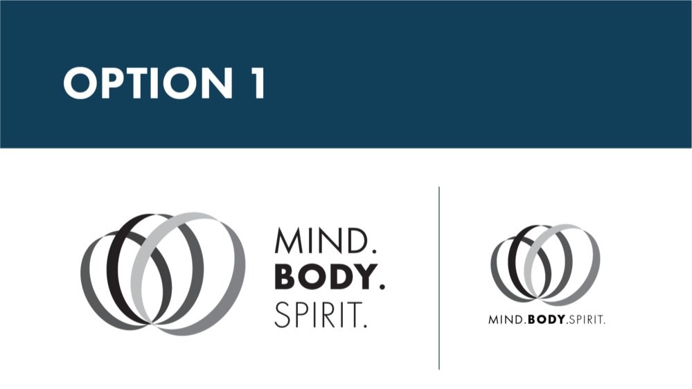
This logo is a non-direct representation of the three areas: Mind, Body, and Spirit. They are not equal in size because, throughout life, each area grows and changes according to where we are in life; however, the goal is to continually work on balancing the three.
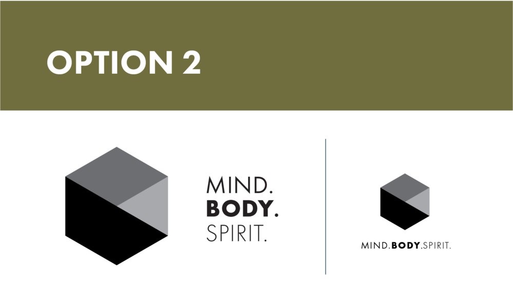
This logo utilizes the most scientifically efficient shape. Hidden in the shapes is also a very subtle nod to the letters M, B, & S. It also has the three areas of color representing each part and the understanding that they need to work together to form the whole.

This logo is a minimal purist representation with a subtle hexagon shape and homage to the YPO triangles. It's a symbol of the spark in life when the three areas of Mind, Body, and Spirit are all in sync.
The Solution
Once aligned with the client on the vision, I designed a simple logo based on circles, reflecting the idea that each area she mentioned is separate yet overlapping. When there is balance in one's career, it contributes to balancing family life, which in turn supports personal health.

Shown are samples of implementing the logo alongside the YPO brand for announcing the initiative to its members.

Explore more projects
-
![]()
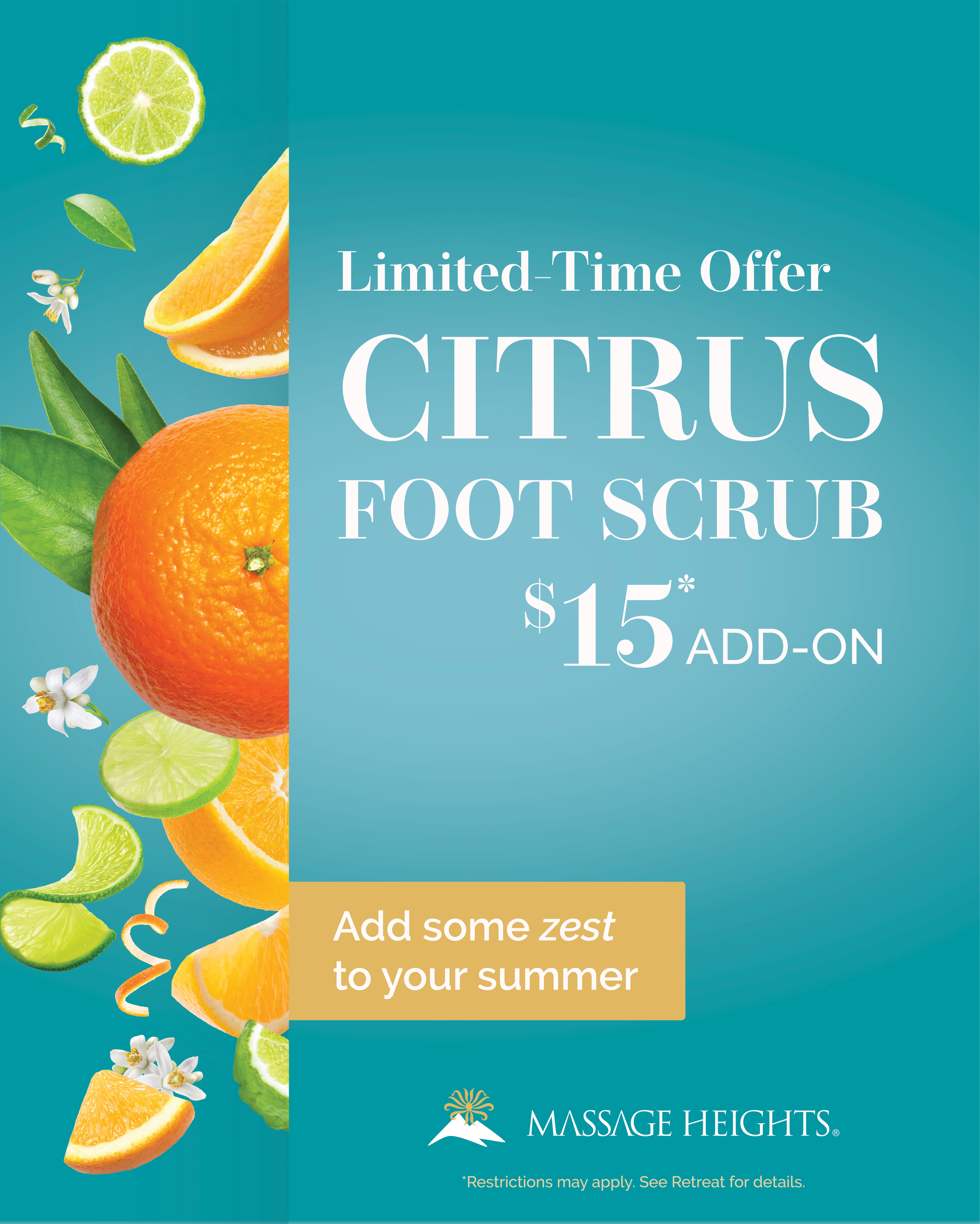
Zesty Summer Campaign
Developing a refreshing marketing campaign to excite members & boost prospect sales.
-
![]()
Mind. Body. Spirit.
Crafting a logo to engage and inspire balance for a global leadership organization’s health initiative.
-
![]()
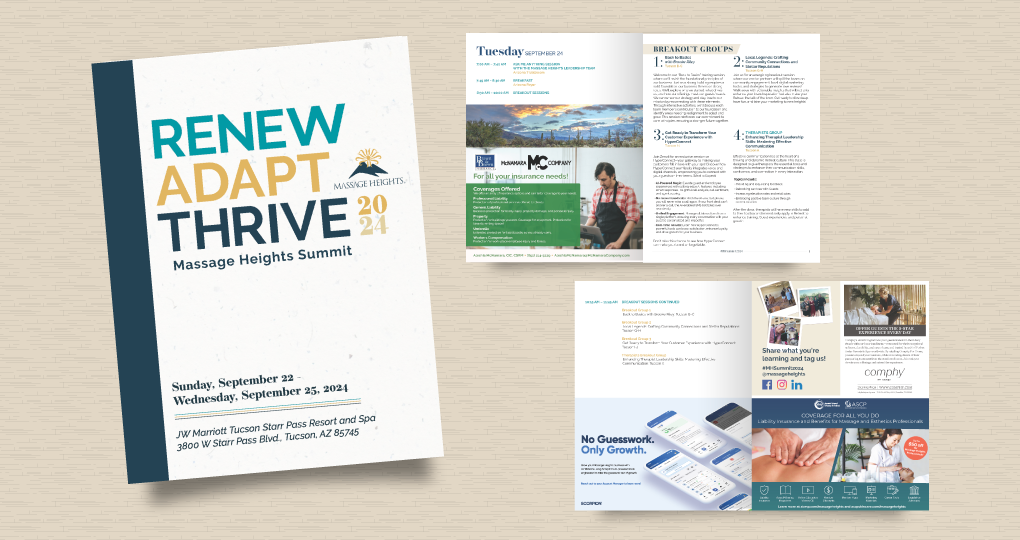
Massage Heights Deliverables
Delivering day-to-day business design needs for a multi-unit franchise brand with 100+ locations.
-
![]()
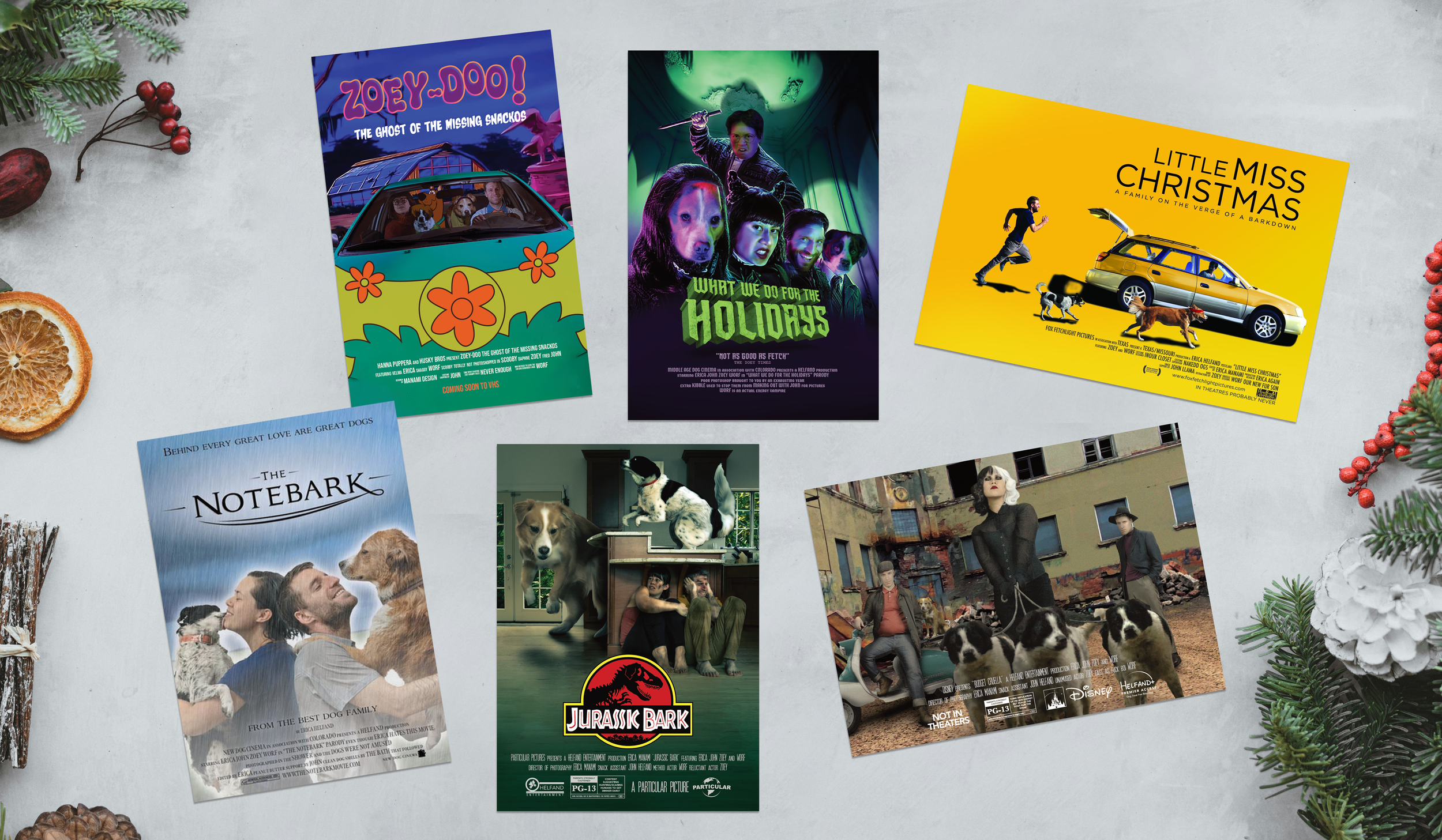
Christmas Movie Magic
Hollywood magic on a budget, with dogs, and a sprinkle of the holidays.